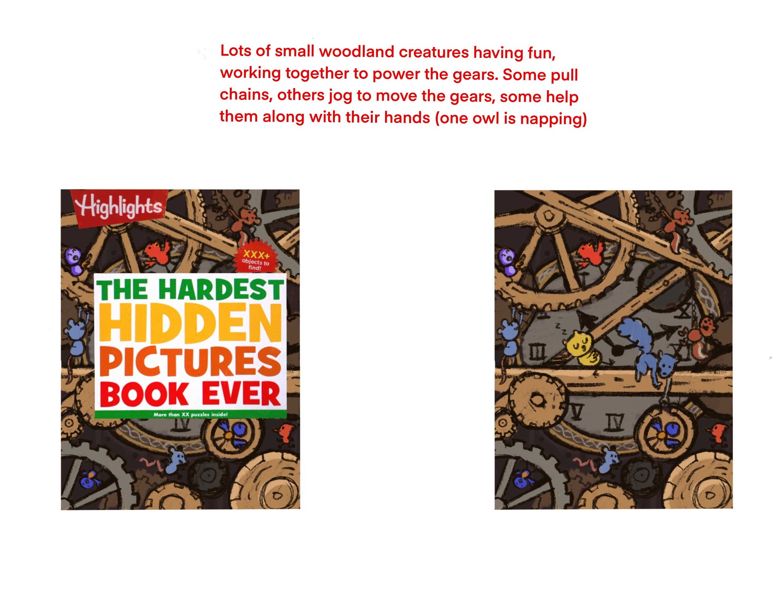
The title of the book is fitting, because the cover was one of the HARDEST freaking HIDDEN PICTURES I’ve ever created!
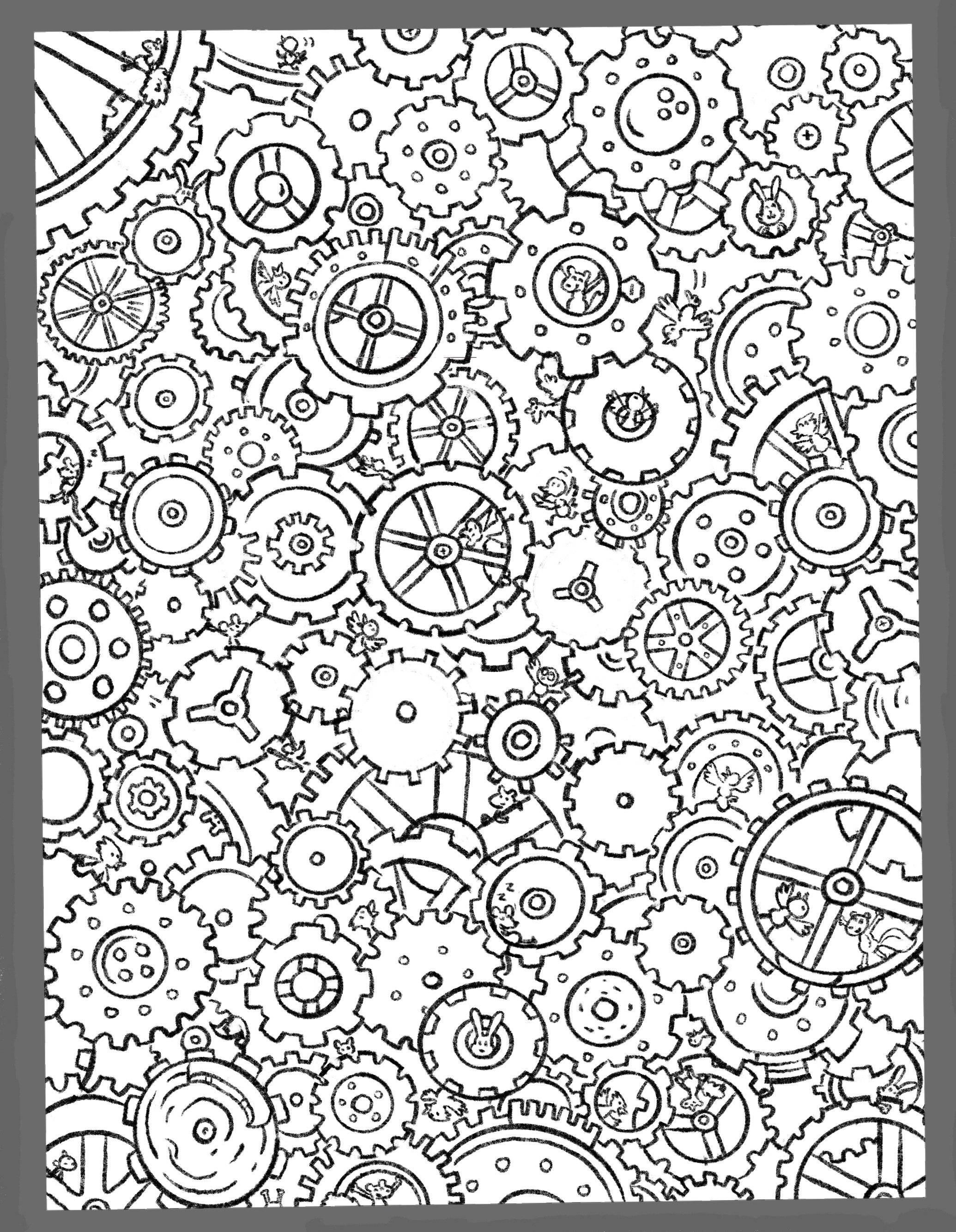
I started by thinking of the setting like a cozy wooden clock interior, with some German or Swiss clockwork vibes. Mostly wood and steel. That was rejected as being a bit too simple, so I tried something a little busier. I submitted thumbnails that had more gears, and more creatures! They liked it, but when I turned in the sketch… they didn’t like it. Not busy enough. This the “HARDEST”, they reminded me!
So, I tried out some color comps, which I didn’t normally do, but we were determined to get this right! White background color, yellow background color, and one with depth! …They weren’t feeling them.
But I pushed on with the sketch, not knowing how I’d tie it all together in the end with color, but knowing I needed to go forward with the sketch nonethelessless. Finally we arrived at a sketch that the editors felt suited the book theme. Then the question of how to make it work, color-wise. I tried a bunch of things; muted colors, grays and browns, some color, LOTS of color! In the end, they chose the limited colors: cream, browns, grays, and the light blue back.
In the end, it’s ok. I like some of the hiding places I was able to put the Hidden Objects. Ultimately, I don’t look at this piece and see my best. But I do see one I worked my hardest on! I’ll take it as a win.